
Twelve years is a long time – and can generate a lot of data. In this case, NASA has used imagery from the last 12 years of its Landsat programme and combined that with the Google Earth Engine. The result is an interactive map that shows how deforestation has literally changed the face of the planet.
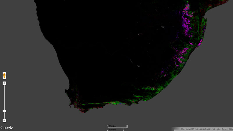
Zooming in on South Africa, the map shows how things have remained fairly balanced. With many paper companies running plantations, those areas show equal amounts of both loss and gain. But even in non-plantation areas there have been losses as well as gains in forests. However, the image isn’t as rosy for the rest of the world.
The edges of the African equatorial rainforest are being eaten into, and the map shows a lot of red – the legend for forest loss – nipping away into the mass of green. There’s more destruction to be witnessed in the Amazon forest, where development and logging have left deep holes in the once-lush greenery. The 650 000 photos that make up the data will leave a lasting impression on anybody who switches to satellite view and sees the difference in vegetation 12 years ago, compared to today.

