
Income inequality is one of several socio-economic issues plaguing South Africa and many other countries across the globe. With women and people of colour in particular earning significantly less in the workplace compared to their white male counterparts.
It’s a systematic problem that has ingrained itself into the fabric of SA, and in most cases is simply accepted as being the norm.
But how can we stop that from being case?
According to UCT’s South African Labour and Development Research Unit (SALDRU), the answer may lie in illustrating where each person falls on the local income spectrum.
This is one of the motivations behind the creation of a new income comparison tool developed by a group of economists at the SALDRU.
“But what does South Africa’s income inequality look like if plotted on a graph? Would the result be regarded as acceptable and normal?,” proposes the SALDRU in a press statement announcing the tool’s availability.
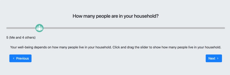
The tool can be accessed online, and asks a handful of questions (three in my case) that can be answered by moving a slider.
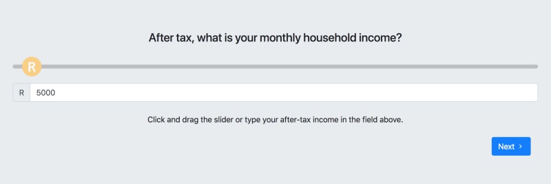

Trying it out on my own (a single male living alone), I noticed a huge disparity between where on the final graph I though I saw myself, and where I actually was as far as SA’s per capita income goes.
Perhaps the most telling question is “From poorest to richest, where do you think you fit?” It likely illustrates that most of South Africans fall well below what the average is perceived to be.
Having tried out the tool, I would have liked to see more questions in terms of demographics, such as age, gender and race, which could have produced some additionally interesting findings.
“The tool was designed to help people understand the nature and extent of South Africa’s inequality. It is designed to help people see themselves in South Africa’s story,” notes SALDRU’s director, Professor Murray Leibbrandt.
Hopefully the greater number of people that try out the tool, the more detailed the findings will become.
Give it a try here, and find out just where you fall in SA’s income spectrum.
[Image – CC0 Pixabay]

