

Almost a year ago Mozilla teased a bunch of potential designs for its rebranding of Firefox. Now the process has come full circle and the company has released a new Firefox logo, as well as a redesigned look for the entire user interface, tools and apps that Mozilla has.
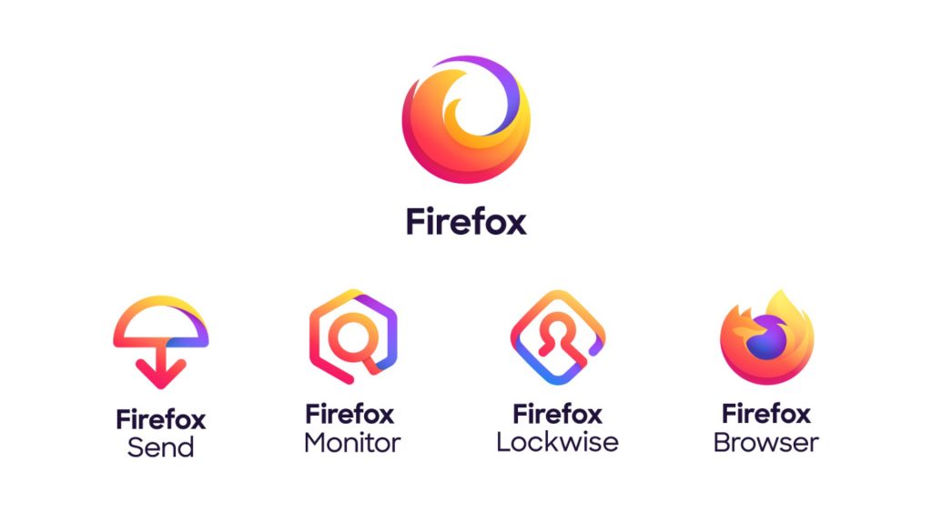
“Today we’re introducing the Firefox parent brand — an icon representing the entire family of products. When you see it, it’s your invitation to join Firefox and gain access to everything we have to offer,” writes creative director at Mozilla, Tim Murray.
“That includes the famous Firefox Browser icon for desktop and mobile, and even that icon is getting an update to be rolled out this fall,” he adds.
While there is still a couple of months to go until Mozilla rolls out the new design to the Firefox community, out initial thoughts on the redesign are generally positive. The Firefox logo itself, as The Verge points out, certainly features more fire than fox, but fans of the animal will be glad to see that it has been retained for the Browser logo.
Along with a new aesthetic Mozilla also introduced a new colour palette for this iteration of Firefox, with it featuring considerably more purple and varying shades of orange than before.
What should prove more interesting is how the community of users rect to the new design in the coming weeks, especially as they’ll let their opinions be known in no uncertain terms given how passionately they feel about the platform and its tools.
Do you think Mozilla got the new design right? Let us know on Facebook and Twitter.

